Ukiyoe: Layer by Layer
Experiencing the evolution of woodblock printing through interactive animation
Dec 2025 - Feb 2026
UI, Context Engineering
Personal Project
Interactive Website
Overview
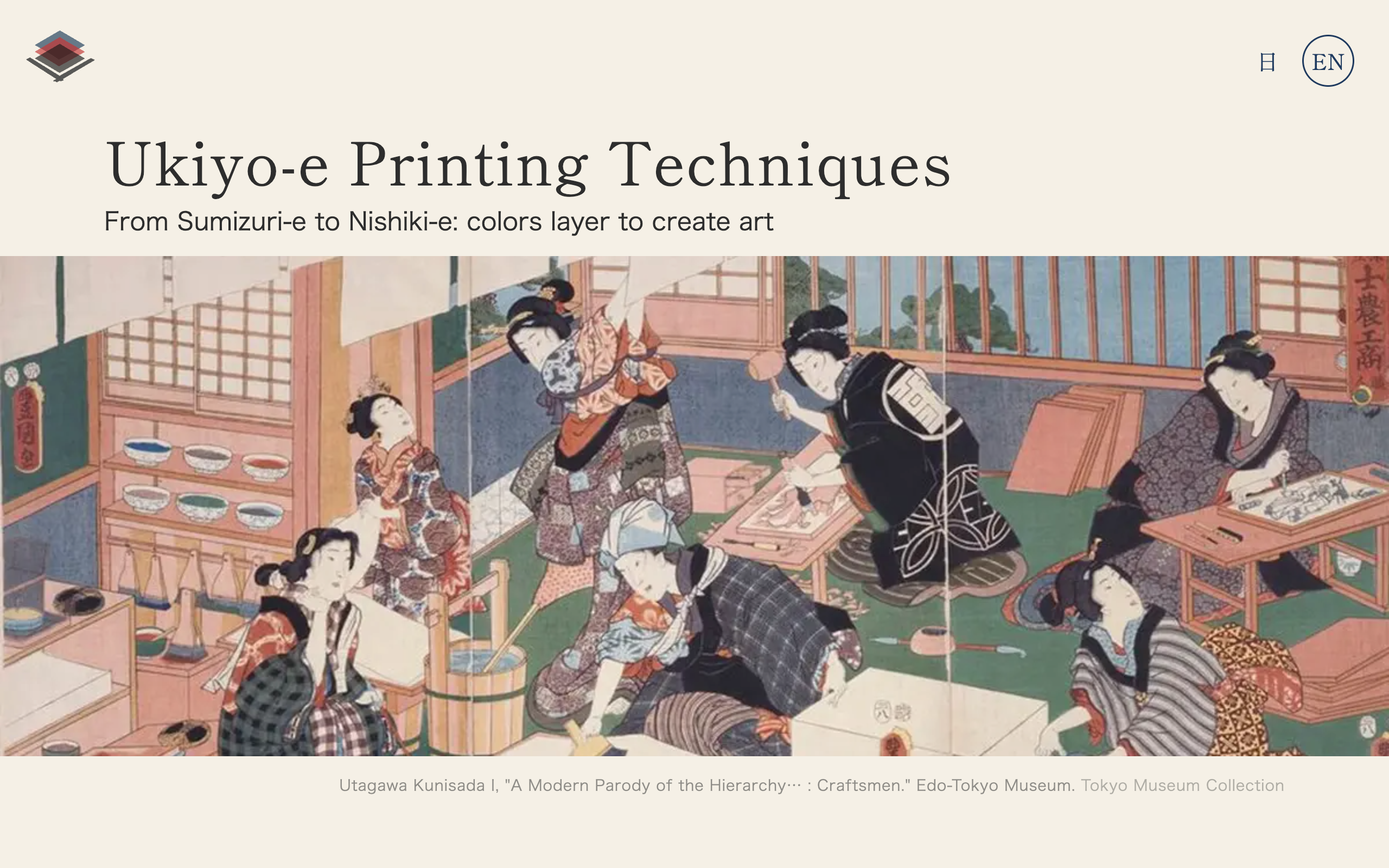
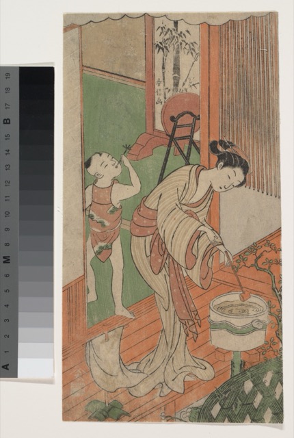
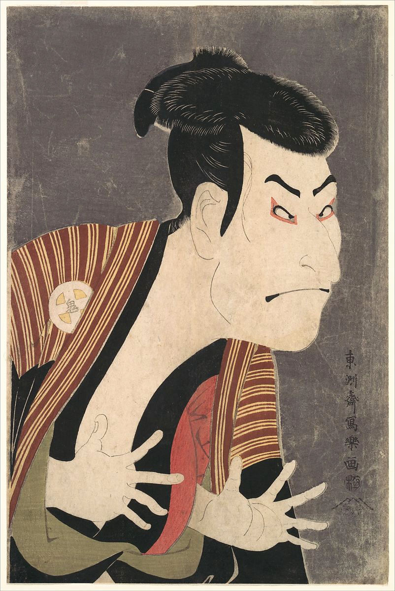
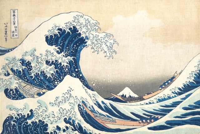
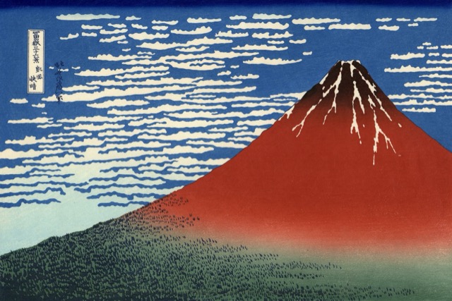
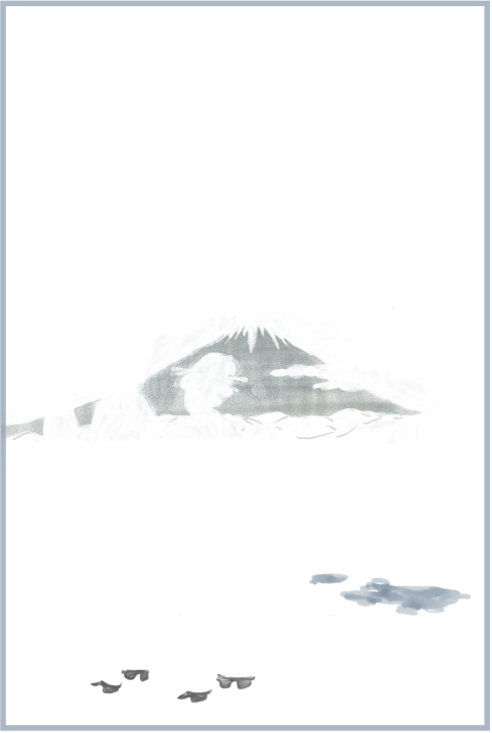
A couple of years ago, I visited the ukiyoe gallery at the Tokyo National Museum. I had seen woodblock prints in textbooks, but the real thing was different. Observing the texture of the paper and the depth of the pigments up close, seeing snow falling on Shinagawa and Fuji rising beyond low rooftops, I felt a quiet resonance with the same Tokyo seen through the eyes and craft of people who lived here centuries ago. Now that AI tools have matured enough to support complex front-end projects, I saw a chance to recreate the layered printing process as an interactive web experience.
I visualized the evolution of printing techniques from monochrome sumizuri-e to full-color nishiki-e through scroll-driven animations. Color layers stack one by one, just as a printer would have done by hand, recreating the printing process.
Research & Discovery
Before writing a single line of code, I immersed myself in the world of ukiyoe — studying printing techniques, analyzing color palettes, and understanding centuries of cultural context.
Cultural Immersion
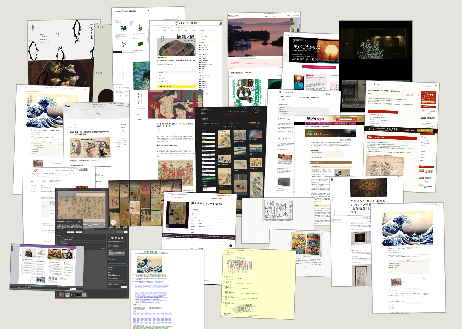
I studied over 25 reference sites including museum archives, printmaking workshops, and academic resources. This research covered the complete woodblock printing process, from carving woodblocks to applying pigments, aligning registration marks (kento), and the sequential layering of colors. Understanding this process was essential to designing animations that authentically represent how each print was made.
Color Extraction & Analysis
Using Python scripts, I extracted dominant color palettes from actual ukiyoe prints across different eras. This analysis revealed how the available pigment range expanded over time, from pure black ink in sumizuri-e to the rich, multi-layered palette of nishiki-e. These extracted colors became the foundation of the site's design system, with CSS variables mapped to historically accurate pigments.
Printing Process Study
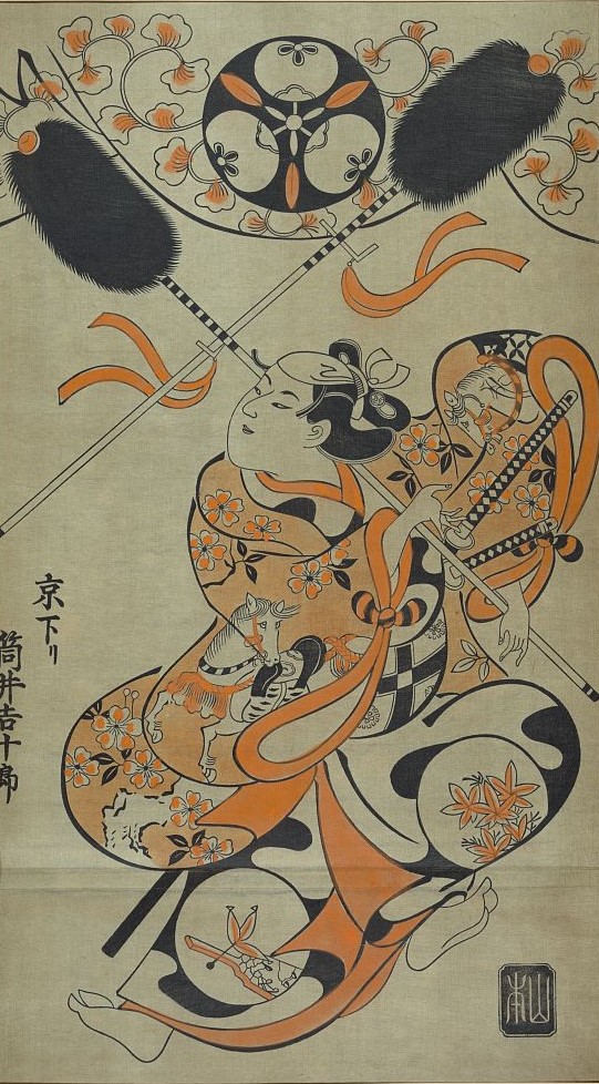
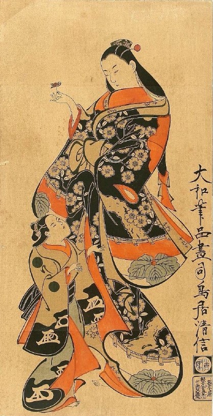
In nishiki-e, a single print could require 10 or more separate woodblocks, each carrying a different color. Understanding this precise sequence was crucial for designing layer-stacking animations where each color appears in historically accurate order.
Design Process
From the trial and error of visual language and motifs to interactive visualizations of historical color data, each process went through its own cycle of exploration, testing, and refinement.
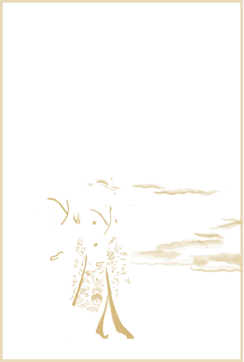
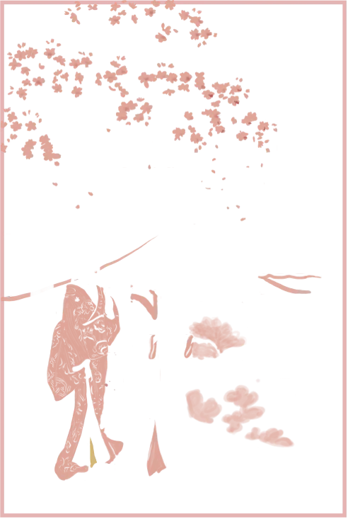
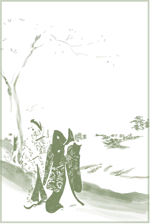
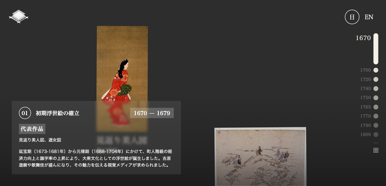
Top Page: Layer Animation
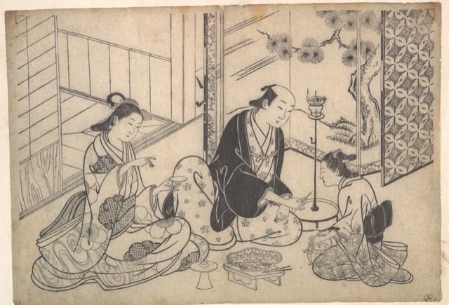
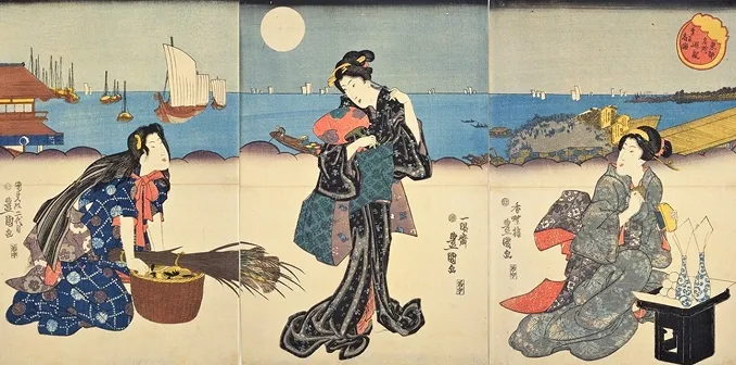
The core concept was to let you — the user — experience how a woodblock print comes together, layer by layer. I began by separating actual ukiyoe prints into individual color layers using Adobe Fresco, hand-painting each layer to match the original pigment colors. This was one of the most labor-intensive parts of the project; AI tools at the time could not generate these layers with the necessary precision.
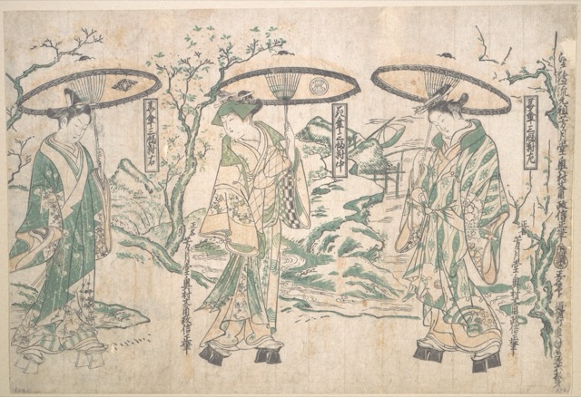
Benizuri-e
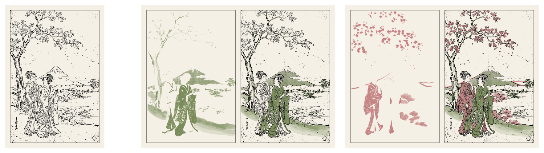
Nishiki-e
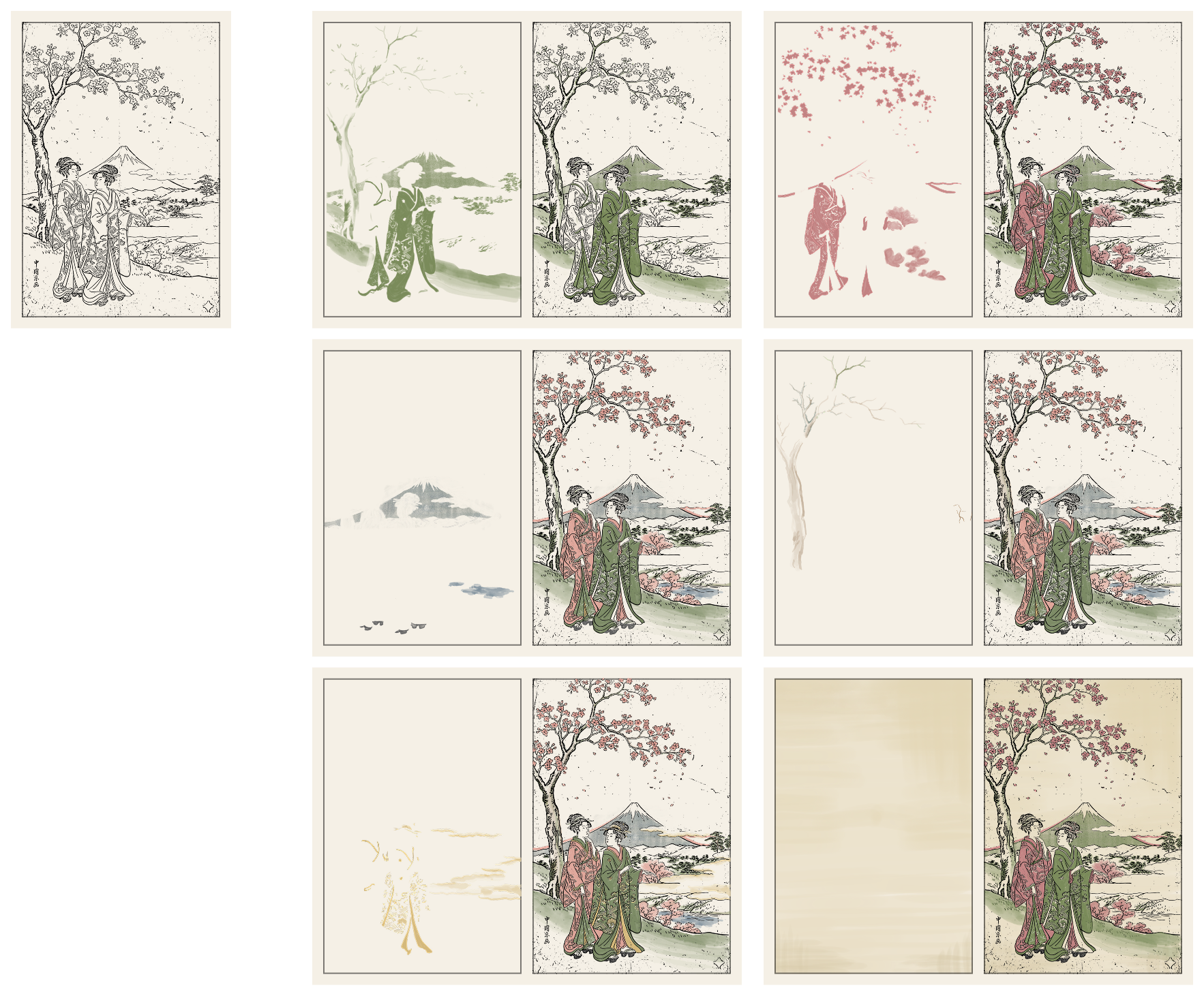
I then converted these layers into SVG format. On the site's top page, I arranged them in an isometric perspective inspired by the flattened spatial composition characteristic of Japanese painting. I explored multiple approaches, from simple vertical stacking to a media-player-style timeline control, before settling on scroll-driven isometric animation.
A key design challenge was storytelling. Raw layer animations without context would confuse first-time visitors. I iterated on the accompanying text sections, balancing educational depth with visual clarity.
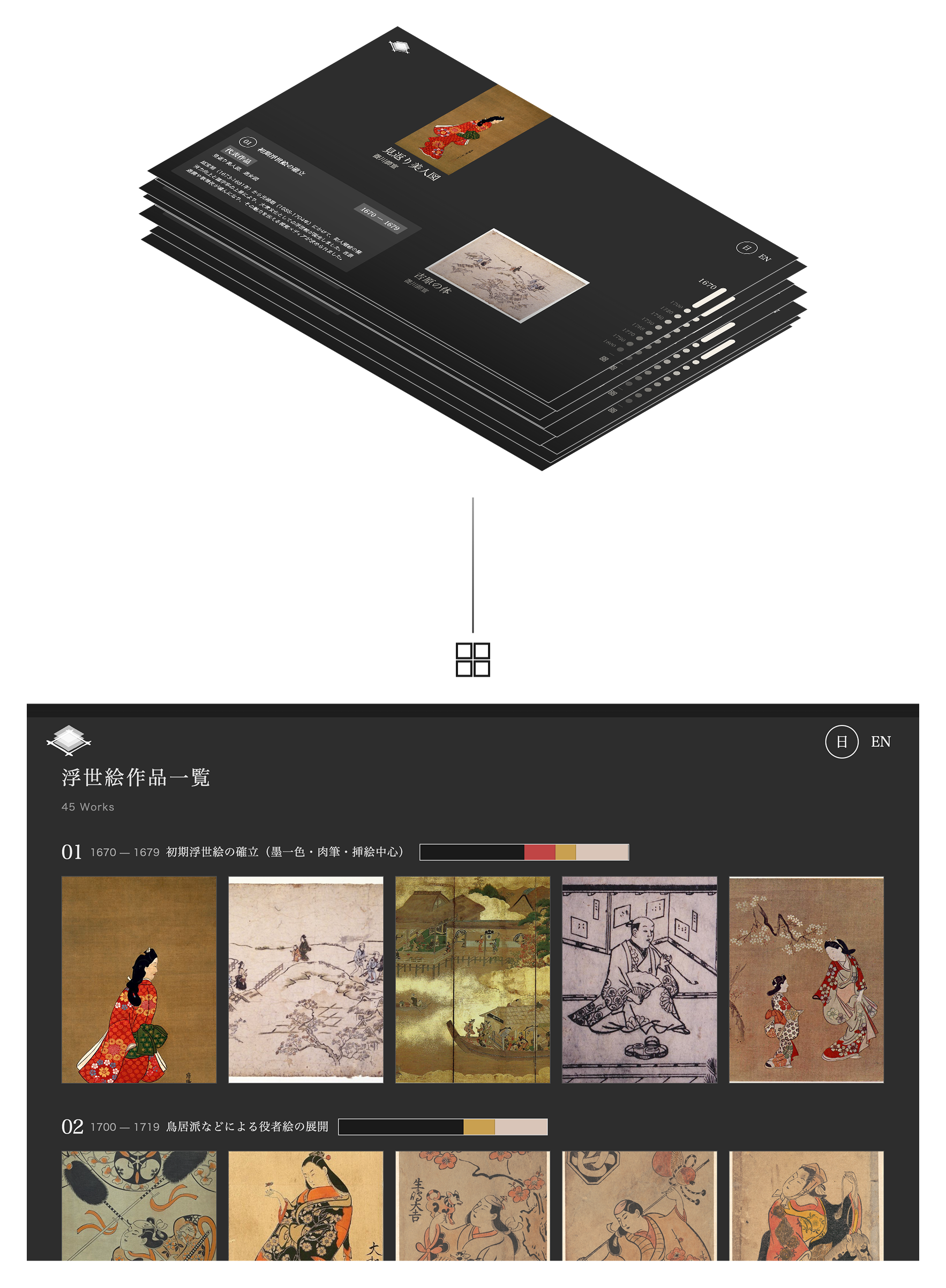
Timeline: Artwork Gallery
The timeline page went through a fundamental architectural shift. Initial designs used a horizontal scroll mechanism with wheel event capture, but this conflicted with native scrolling behavior and caused persistent UX issues. After two failed patch attempts, I rebuilt the entire page using native vertical scroll with parallax effects.
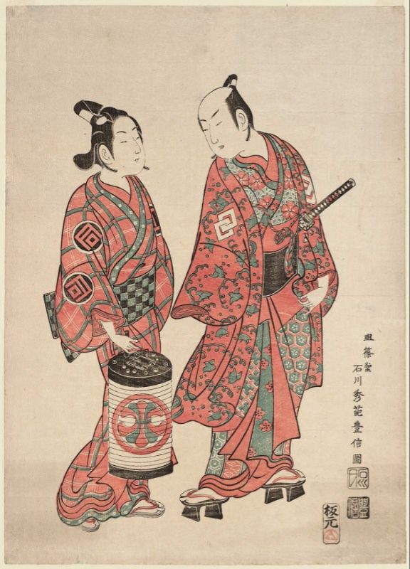
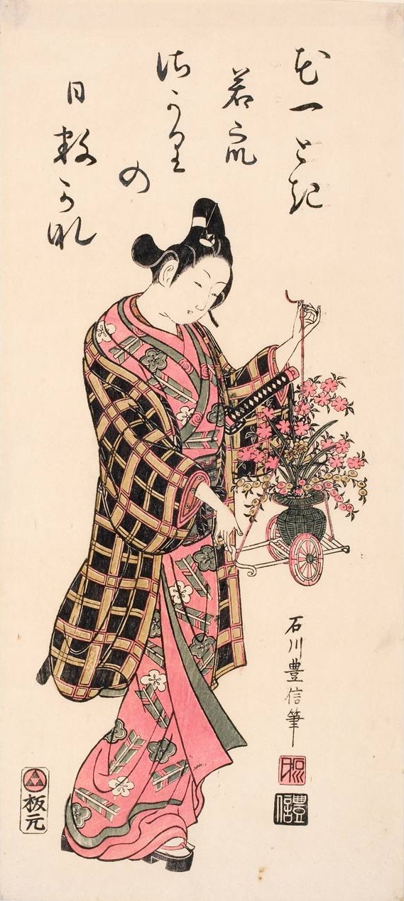
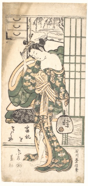
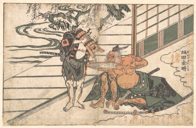
The key design insight came from considering how ukiyoe was consumed in the Edo period: not in museum frames, but as mass-produced prints in everyday life. This led to a more organic, randomized artwork layout rather than a rigid grid, with each era's artworks presented alongside a color swatch visualization showing how the available palette expanded over time.
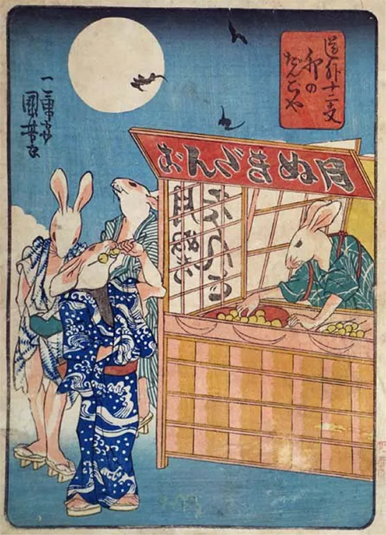
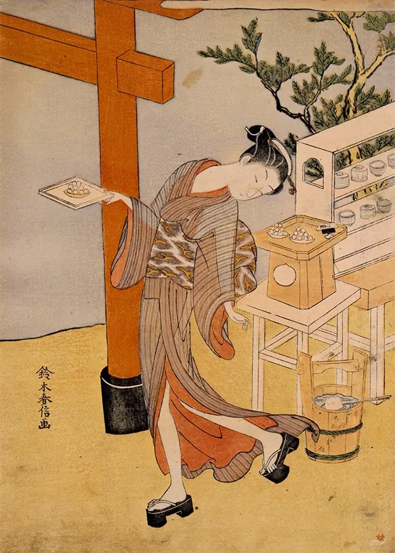
Design Motifs: Kushi-Dango
Kushi-dango are three-colored rice dumplings on a skewer (pink, white, and green), a traditional Japanese sweet enjoyed at tea houses and during hanami and tsukimi since the Edo period. The shape of round mochi threaded on a stick inspired this site's recurring navigation pattern: the line-and-dot motif across timeline bars, CTAs, and indicators.
On the timeline page, white circular indicators against the dark background serve as a double metaphor: dango on a skewer, and the moon as ukiyoe artists often depicted it, a luminous white circle. Moon viewing (tsukimi) and dango are culturally inseparable in Japan; offerings of dango are placed beneath the harvest moon on the fifteenth night.
The right column shows that dango was a recurring subject in ukiyoe itself, appearing in scenes of tea houses, street vendors, and seasonal customs. It shows how deeply this confection was embedded in Edo-period visual culture.
Color System & Period Ratios
The timeline gallery features a color proportion bar for each historical period, showing how the available pigment palette expanded over centuries. But how were these ratios determined?
Rather than pixel-level analysis of artworks, the proportions are estimated from art historical knowledge. The technique descriptions for each era guided the weighting. For sumizuri-e (ink-only prints), black ink dominates at 50-60%. For benizuri-e, red and green emerge as the technique's defining colors. By the nishiki-e era, colors distribute more evenly as multi-block printing allowed a full spectrum. The values are hand-curated estimates, documented with their reasoning and limitations.
In the timeline gallery, each era displays a horizontal bar where the width of each color segment equals its estimated proportion. Nine canonical color slots, from sumi (ink black) to bero (Prussian blue), are normalized so that active colors are prominent while unused slots appear as ghost elements. This visualization communicates at a glance how printmaking evolved from monochrome to polychrome.
Logo Design
The logo design explored the intersection of traditional hanko (seal) aesthetics and modern typography. Starting from the idea of combining a seal stamp with the characters for '浮世絵', I iterated through seal-framed versions, simplified typographic treatments, and eventually arrived at a design informed by historical publisher marks (hanmoto logos), finding the balance between Edo-period authenticity and contemporary readability.
In the final design, three isometric layers overlap in colors representing each era: sumi (ink black) for sumizuri-e, beni (crimson) for benizuri-e, and ai (indigo) for nishiki-e, expressing the color evolution of ukiyoe itself. Beneath the layers sits a wooden frame structure. The ukiyoe production process fundamentally depends on carvers cutting designs into woodblocks. As a nod to this foundation, I placed a wooden base under the layers and referenced kumiki (wood joinery), the traditional Japanese technique of interlocking timber without nails. While kumiki has no direct connection to ukiyoe, it shares the same material: wood, and represents the broader tradition of Japanese craftsmanship. The mark carries both respect for the actual tools of ukiyoe production and the deep heritage of Japanese woodworking culture.
Hand-Coloring the Layers
The core animation on this site shows color layers stacking to form a complete print, just as a real Edo-period printer would have pressed each woodblock in sequence. To build this, I needed images of each individual color layer: the red pigment areas on one layer, green foliage on another, gold accents on a third.
These assets do not exist in any dataset. I tried AI image generation, but it could not produce layers with the color accuracy and edge precision required to align and stack convincingly. So I did what a printer would have done: I separated the colors by hand.
Using Adobe Fresco, I painted each layer individually, referencing the original prints to match pigment areas. This was the most time-consuming part of the entire project, and the part AI could not shortcut. The timelapse below shows the process.
AI Can Create, But It Can't Craft
I estimated this project would take 2 to 3 weeks with AI handling the implementation. It took three months. Not because AI failed, but because the work that mattered most turned out to be the work AI could not do: hand-coloring layer assets, making cultural design judgments, and finding unexpected connections between historical research and interaction design.
AI was still central to execution. I used Claude and Cursor to prototype components, iterate on responsive layouts, and implement scroll-driven animations that would have taken much longer to build alone. But my process goes beyond prompting. I bring cultural context, historical references, and design intent into every interaction. When building the timeline's color system, I did not ask AI to "pick nice colors." I researched pigment histories, wrote Python scripts to extract colors from museum archives, then designed a canonical slot structure that makes 130 years of palette evolution legible at a glance. AI implemented each step faster. The story, the structure, and the judgment were mine.
AI can create, but it can't craft. Craft is the narrative behind a design choice, the sensitivity to a cultural context, the attention to a detail that nobody requested but that makes the whole thing feel intentional. The isometric layer animations, the kushi-dango navigation motif, the canonical color slots: each reflects a specific design decision rooted in genuine research, not generic output. What AI gave me was speed. What I brought was direction, a cultural story, and the conviction that the details matter.
Technical Highlights
Built with React 18 and Vite 6, using Framer Motion for scroll-driven animations and a custom CSS variable-based design system with historically-derived color tokens.
Scroll-Driven Layer Animation
Framer Motion's useScroll and useTransform hooks orchestrate layer-stacking animations synchronized to scroll position. Each technique era has its own set of hand-painted layers that stack progressively.
Parallax Artwork Gallery
A native scroll-based parallax system where artwork images move at different speeds based on depth. Fixed period panels and progress indicators help users navigate five historical eras.
Cultural Color Tokens
CSS variables map traditional color names like sumi-iro (ink black), beni-iro (crimson), and ai-iro (indigo), creating a cohesive visual language that respects the source material.
Color Palette Visualization
Nine normalized color slots per era: active colors displayed prominently, unused slots as ghost elements. This visually communicates how the printmaking palette expanded from monochrome to polychrome.
Reflection
What I Learned
Standing in front of those prints at the Tokyo National Museum, I was moved by a simple fact: the same streets I walk today once looked entirely different, and someone centuries ago cared enough to carve that vision into wood, ink it, and press it onto paper, one color at a time. This project let me follow that same impulse through a different medium.
What I learned is that genuine curiosity about a subject is not separate from the design process. It is the design process. Understanding that nishiki-e required 10+ woodblocks shaped the animation sequence. Knowing that ukiyoe was mass-produced popular art, not gallery pieces, shaped the timeline's casual layout. Researching Edo-period publisher marks shaped the logo. Every design decision traced back to something I learned because I wanted to, not because a brief required it.
Cultural context is not decoration. It is the design foundation. And in an era where AI can generate layouts, write code, and produce visual assets at speed, what sets work apart is craft: the cultural story behind each decision, the hand-painted layers that no algorithm could shortcut, and the conviction that these details are what make a project feel genuinely made, not just generated.
Future Directions
Ongoing optimization for mobile performance and image loading, with future plans for additional artwork data, audio narration, and deeper interactive demonstrations of individual printing techniques.